The story behind the Triumph logo
The Triumph logo is one of the most recognisable in the global motorcycles industry, here’s how it came to be over the last 118 years
 badge.jpg?width=1600&aspect_ratio=16:9)
The Triumph logo has for 118 years become one of the most easily recognised motorcycle emblems on the planet. Whether it’s spelled out in the red, the white and blue of the Union flag, the more recent triangle badge with union flag inlay; riders and non-riders from across the planet instantly recognise the emblem, and the bike as a Triumph.
The badge has obviously not been able to just sit still either, having to be constantly adapted and tweaked to keep up with the times and maintain the brand’s image. But how exactly did it become the instantly recognisable piece it is today?
If anyone should be able to know, it’s Triumph’s head of Brand Management, Miles Perkins. He’s just one of the design team that carefully created the current iteration of the iconic Triumph logo.
.jpg?width=1600)
“The creation of the new badge with its Union Flag detailing and Triumph logo was inspired by the original makers mark engine badge triangles from the 30’s, and was first sketched out at the factory with the Triumph engineering team.”
Sadly, he doesn’t have that original hand-drawn scamp anymore – ‘’I’m kicking myself as this would have been a wonderful memento’’ – but he does have the inside track on how and why the company’s logo has changed since 1902.
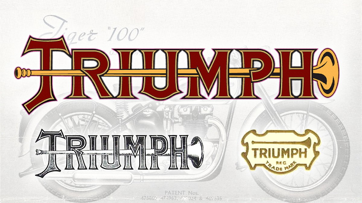
The Triumph Trumpet: a 19th-century mark of approval
“One of the very first logos had a slightly religious leaning about it, the trumpet possibly signifying the triumphant fanfare at the gates of heaven. With Siegfried Bettmann choosing Triumph over his own name to brand his new cycles, both for being more easily pronounced and for intoning a much more positive and uplifting spirit. Those early bikes gained the nicknamed Trumpets from their owners.”
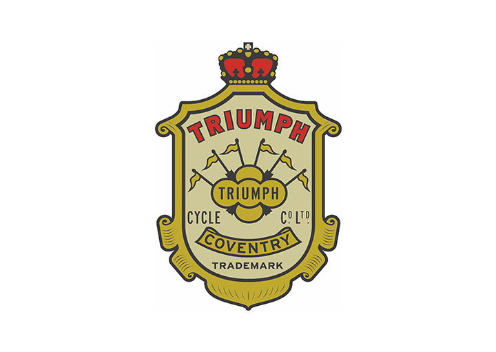
Crest: 1902-1906
“The crest logo represents Triumph as a company and product you could trust through its confident and bold establishment design. It also intones a celebration of the imperialism of the time, and the six flags possibly represent the continents covered by the Commonwealth.”
First signature: 1907-1922
“This script style design logo sought to make Triumph appear less of a faceless manufacturer and more approachable, by making the firm’s voice more personal, stressing the emphasis that was put on human craft, care and engineering. In simple terms this logo said ‘you can trust us’.”
The second Triumph crest: 1922-1932
“After the First World War, faith and trust in British products was a major selling point for firms based in the UK, and Triumph founder Siegfried Bettmann strengthened that message with an evolution of the old crest design. A shrewd businessman and Bavarian skilled in import and export, he recognised that Coventry was the then silicon valley of the bike world and added red, white and blue to the patriotic mix as well as emphasising the links with Coventry. Clever move.”
Map: 1932-1933
“This was a reasonably short-lived logo and not as iconic or well known as the script version. It reflects the logo’s expanding role in advertising and magazines of the day and stresses the message that Triumph encompasses the world, and the world can be conquered more easily on a Triumph.”
Smile line: 1934-1990
“Advertising was becoming an altogether more sophisticated art and the idea that branding was about delivering a clearer message on quality and personal choice came increasingly to the fore. This was the start of the age of the science of brand with the advent of television so the logo, with its distinctive smile line, was born.
“The T in Triumph was drawn to symbolise the piston in an engine’s cylinder head while the serif font and sweeping line from the R to the left of the H were very much the design flavour of the day, bringing a more instantly recognisable human touch taking the lead from Victoriana and the Art Deco design.”
Triumph reborn: 1990-2005
“Following receivership in 1983 and John Bloor’s rescue shortly after, the logo needed another evolution that reflected the amazing renaissance of the business and the energy of the motorcycle boom of the 90’s. Every element of the logo was sharpened up a little and the smile line brought to the front of the H to give it more balance, reflecting the new-found strength and stability of the brand. In line with the design style of the day it became a more solid, modern and symmetrical logo to be trusted’.’
Serious but with more personality: 2005
“A subtle change in colour and continuation of the sweeping line – which some have suggested represents the open road from the valley into mountains – and the addition of a contemporary blue colour change modernised the logo all over again signifying the comeback was complete, with Triumph now starting to grow across all categories. The new design simplified the main strokes of the letters even further whilst introducing a more flowing feel with subtle rounded letter edge detailing. This added even more personality and distinctiveness whilst maintaining the classic overall logo form and smile line.”

Design brief for a modern icon
“The brief in 2015 was to evolve the logo once again to better represent, and sit alongside, the breadth of new products and categories Triumph had grown into – from the classic, to the sports and the adventure, all without losing its core iconic flowing smile line and form. The first step was to subtly update the letters, making the spacing and alignments more symmetrical, lowering the height of the T and lightening the letter forms a little.
“We also reduced the amount of serif detailing whilst maintaining the soft rounded corners. Our aim was threefold, to keep that friendly, human feel and all those heritage cues, to make it cleaner and more suitable for use in digital advertising and finally to have a logo that would look as right on a naked sports bike as it did on a modern classic.”
Along with an evolved logo Triumph also created the new triangle badge to provide a more singular symbol of the brand. This incorporated the Union Flag, the logo and timeless shape of the original ‘engine makers mark’ that first appeared with patent details on the engine casing of 1939 Speed Twins.
Miles adds: “Most motorcyclists who ride big bikes would certainly know the Triumph logo and continue to associate it with an incredibly rich history, technical excellence, and of course British engineering. Our challenge, as those that came before us who have shared custodianship of this incredible brand, is to make sure that as times change the brand continues to evolve to reflect today's riders and their passion.’’
.jpg?width=1600)
.jpg?width=1600)
