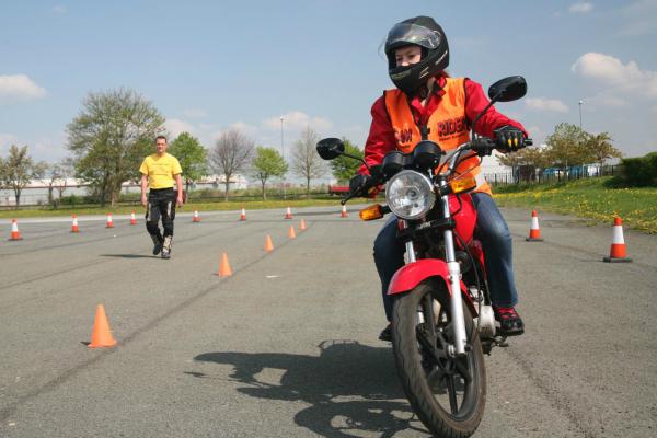


Picking the best motorcycle helmet for you is a hugely important decision. While there's a saying that you should always buy the most expensive motorcycle helmet you can afford, there is a little bit more to the decision than that.
In theory, a more expensive crash helmet should provide better protection in the event of a crash, and be quieter and more comfortable, although that isn’t always the case.
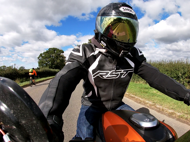
Here at Visordown, we are always out and about testing the latest motorcycles, electric motorbikes, kit, tech, and clothing. We review motorcycle helmets after putting in the hard miles in all conditions to help you make an informed decision. This list includes the best motorcycle helmets we have tested, and some that we haven’t or that are arriving soon – we’ll make that clear if it’s the case though.
We'll be updating this list as time goes on and new helmets are released and tested.
We also have a guide to help you choose the correct motorcycle helmet for the type of riding you do.
Types of motorcycle helmets tested:
Sports | Road | Modular | Adventure | Off-road

The best motorcycle helmets for sports and track riding
These motorcycle helmets are designed and developed to perform at their best on the road and track where performance at speed is a must. They will in some cases be compromised in normal road riding situations, and are quite often not the best choice if you are planning to ride large distances while wearing them.
AGV Pista GP-RR

Specs features and price
Price (RRP) | Weight (grams) | Sun visor (Y/N) | Strap type | Sharp Rating |
£999.99 | From 1,450g | No | Double D ring |
Pros and cons
Pros
· MotoGP-inspired design
· Extremely stable at high-speed
· Highest possible Sharp rating
Cons
· Noisy at almost any speed
· Visor won’t stay open above 40mph
· Not much space for an intercom
VIEW DEAL ON AMAZON HERE
The AGV Pista GP-RR is one of the most widely used motorcycle helmets on the MotoGP grid, with the likes of Valentino Rossi, Jack Miller, and Joan Mir just a few of the big names to use the model. It’s an aggressively designed lid, born to be used on the track. As such, it does have some limitations when used in a more everyday setting, the biggest drawback being the wind noise at speed.
It is though extremely stable at high speeds, and even at nearly 200mph remains very stable and well behaved. The interior is fully removable and washable and features an adjustable crown pad to enable a tailored fit.
If the Pista GP RR seems a bit too racy for you, you could always opt for the slightly comfier, less focused, and cheaper - read the review of that helmet here: AGV Corsa R review.
More information on the AGV Pista GP-RR can be found here.
Read also: AGV Pista GP-RR review.
Shoei X-Sprit III
Specs features and price
Price (RRP) | Weight (grams) | Sun visor (Y/N) | Strap type | Sharp Rating |
£609.99 | From 1,410g | No | Double D ring |
Pros and cons
Pros
· Supremely comfortable
· Excellent stability
· Very quiet
Cons
· Visor changing mechanism is fiddly
· Interior is a pain to install after washing
· Exterior spoiler is fragile
VIEW DEAL ON AMAZON HERE
I’ve used the Shoei X-Sprit III for a few years now, and have toured, commuted, ridden on track and even on hit the trails while using it. For a motorcycle helmet designed to excel on the track, the fact that it still works in all those other scenarios is testament to just how good it is.
Quiet, extremely comfortable, and stable at speeds in excess of 200mph are just a few of the reasons this is one of the best motorcycle helmets you can buy. Add to that a low starting price, compared to some of the competition anyway, and there really isn’t much to dislike!
More information on the Shoei X-Sprit III can be found here.
Shoei X-SPR Pro

Specs features and price
Price (RRP) | Weight (grams) | Sun visor (Y/N) | Strap type | Sharp Rating |
££699.99 | From 1,450g | No | Double D ring |
Pros and cons
Pros
· Class-leading ventilation
· Excellent stability
· Very quiet
Cons
· Visor changing mechanism is fiddly
· I needed a personal fit to make it secure
· Comfort isn't quite as good as the X-Spirit III
VIEW DEAL ON AMAZON HERE
I've been testing the new FIM homologated X-SPR Pro for most of this year and have been testing it on road and track, on a multitude of different styles of bikes. With such a good experience with the X-Spirit III, I was fully ready to enjoy the new lid just as much. While on many fronts the X-SPR does trump the preceding product, I didn't find the X-SPR to be quite as comfortable, and I needed to book in for Shoei's Personal Fitting Service (PFS) to get a secure and stable fit for my head shape.
For a more detailed look at this helmet, check out my full review of the Shoei X-SPR here.
More information on the Shoei X-SPR Pro can be found here.
Arai RX-7V Evo

Specs features and price
Price (RRP) | Weight (grams) | Sun visor (Y/N) | Strap type | Sharp Rating |
£799.99 | From 1,560g | No | Double D ring |
Pros and cons
Pros
· All day comfort on road and track
· Excellent vents
· Timeless design is still stylish today
Cons
· Visor locking mechanism is fiddly if wearing winter gloves
· Some people simply don’t suite the Arai head shape – try before you buy
· Not the lightest motorcycle helmet on this list
VIEW DEAL ON AMAZON HERE
If you are looking for a brand that is renowned for making the best motorcycle helmets money can buy, Arai is the name that continually crops us. With a design ethos that stretches back to the beginnings of the company, the way Arai designs, develops and manufactures its motorcycle helmets is unique.
The Arai RX-7V Evo is the pinnacle of the range and is worn on track by the likes of Dani Pedrosa, Maverick Viñales, and Darren Binder. While it may look very much the same as every RX-7 that has come before it, behind the scenes is being steadily evolved in the pursuit of creating the ultimate motorcycle helmet.
More information on the Arai RX-7V Evo can be found here.
You can read the full review of the Arai RX-7V Evo here

The best motorcycle helmets for general road riding
These motorcycle helmets will provide you with a good balance of performance at high speed, comfort on long rides and usability in adverse weather conditions. That will be without compromising on safety and performance in a crash of course.
Arai Quantic

Specs features and price
Price (RRP) | Weight (grams) | Sun visor (Y/N) | Strap type | Sharp Rating |
£599.99 | From 1,640g | No | Double D ring | Not yet rated |
Pros and cons
Pros
· Excellent comfort
· Great ventilation
· Probably the best all-round motorcycle helmet you can get
Cons
· Visor locking mechanism is fiddly if wearing winter gloves
· Central forehead vent tricky to use
· Not the most inspired choice of colours available
VIEW DEAL ON AMAZON HERE
I’ve been running the Arai Quantic for more than a year now and it is my go-to lid for everyday riding, commuting, and touring. It’s proof of Arai’s philosophy that constant evolution yields the best results, and for 90% of the riding I do, it’s perfect in almost every way.
There are a couple of small niggles; the main being that the centrally mounted forehead vent can be tricky to operate, although in general there isn’t much to moan about. The amount of airflow through the updated vents is the most noticeable thing though, and the Quantic wins the award as being the most ventilated helmet I think I’ve ever used. The Quantic also features a very quiet interior that is good for six hours or more in the saddle. It really is the lid that should be in every rider’s collection.
More information on the Arai Quantic can be found here.
Read also: Arai Quantic review.
Shoei NXR2

Specs features and price
Price (RRP) | Weight (grams) | Sun visor (Y/N) | Strap type | Safety Rating |
£449.99 | From 1,390g | No | Double D ring | ECE 22.06 |
Written and tested by Alex Strange.
Pros and cons
Pros
- Comfortable for all-day riding (aerodynamic too)
- Super safe, meeting the ECE 22.06 rating ahead of time
- Great visibility
Cons
- More positions needed for the visor, and it’ll decide it wants to be closed when open slightly.
- An internal sun-visor would be nice, especially as the dark tints are seemingly hard to find
- Personally not too keen on any of the pricier graphic options
VIEW DEAL ON AMAZON HERE
Endorsed by Marc Marquez himself, the Shoei NXR2 follows a rich line of well-adored motorcycle helmets, with the 2021 NXR2 achieving the upcoming future standard of safety ratings: ECE 22.06. Available with 5 shell sizes and various inner pad sizes, anyone XXS to XXXL is covered.
I’ve been running the NXR2 for just under a year now, covering an estimated 7500 miles in that time, and it has certainly taken the crown for being my go-to lid in any & all conditions. Weighing in at around 1390g (around 50g more than the NXR), it’s comfortable to wear for long days in the saddle, well ventilated with 6 inlet vents & 4 exhaust, and importantly, overall a quiet lid.
Coming out of the box with a Pinlock visor, visibility is top-notch - and the undoubtedly rigorous aerodynamic testing has paid off, with next to no lift and drag noticeably when riding at speed (Shoei state improvements of 6% reduction in lift, and 4% reduction in drag compared to the NXR).
Though not fitted with a built-in sun visor that some may appreciate, and dark visors seemingly hard to come by, the niggles are few and far between - perhaps the visor system being a bit clunky is one. There is space for an intercom unit to be fitted, too (I’ve gone for the Cardo Packtalk Edge) though the wide rim makes it tricky for a slide-in baseplate, so a stick-on pad is the go-to.
Though priced up at a premium £449.99 in grey (as tested, graphic options are pricier & a tad heavier), you truly get what you pay for with this helmet - I’d absolutely opt for the Shoei NXR2 when undertaking a long-tour.
The best flip-front or modular motorcycle helmets
Flip-front or modular motorcycle helmets mix the convenience of an open-face helmet with the protection of a full-face item. They are great for riders who regularly get off their bike to enter premises and shops, and are a firm favourite with people undertaking long-distance motorcycle tours.
Schuberth C5

Specs features and price
Price (RRP) | Weight (grams) | Sun visor (Y/N) | Strap type | Sharp Rating |
£499.99 | From 1,660g | Yes | Ratchet | Not yet rated |
Pros and cons
Pros
· Head hugging comfort
· Easy to vents
· 85dB at 60mph is very quiet
Cons
· Styling still not to everyone’s taste
· 1,660g puts it at the heavy end of the spectrum
· Pinlock can cause problems in heavy rain
VIEW DEAL ON AMAZON HERE
The Schuberth C5 flip-front motorcycle helmet is one of the safest modular products you can buy, as it is tested to the most recent (and stringent) ECE 22.06 regulations. It is equipped with a host of handy features, to make everyday use and longer riders more comfortable.
Read also: Schuberth C5 review.

The best motorcycle helmets for adventure motorcycle riders
An adventure motorcycle is one designed to excel both on the road and in more extreme circumstances like trails and green lanes. Because of this, an adventure motorcycle helmet must tick both boxes to become successful. The adventure bike sector is also one of the fastest growing and most hotly contested of all, meaning the competition for the top spot among helmet manufacturers is just as closely fought.
Shoei Hornet ADV

Specs features and price
Price (RRP) | Weight (grams) | Sun visor (Y/N) | Strap type | Sharp Rating |
£479.99 | From 1,660g | No | Double-D ring | Not yet rated |
Pros and cons
Pros
· Plush interior feels very comfortable
· Peak helps out with low sunshine
· Lightweight compared to some adventure lids
Cons
· Vent’s aren’t the best
· Interior liner holds in moisture when riding off-road
· Not designed for use with goggles - you can but it’s not ideal
VIEW DEAL ON AMAZON HERE
The Shoei Hornet ADV has been around since 2015, and while it is probably due for an update/replacement, it’s still more than worthy of a sport on our best motorcycle helmet list. It’s extremely lightweight for an adventure helmet, performs well on and off-road and is my go-to choice for adventure motorbike riding. I’ve covered getting on for 100,000 miles in my Hornet ADV, and really only have a couple of gripes. While the liner is very plush and comfortable, it does hold in moisture like a sponge, making adventure riding a sweaty, slightly grim affair. It also doesn’t dry out very quickly, and can still be moist the day after an off-road ride. While you can use it with goggles, the shape is not best suited to it, and as the vents aren’t as good as some other lids on the market, that can cause an issue.
That said, it’s extremely important light, has a brilliant visor that has never let me down, and is quiet and comfortable. The peak is cleverly designed too, with vents and holes in it to help prevent fatigue.
More information on the Shoei Hornet ADV can be found here.
Read also: Shoei Hornet ADV review.

Best motorcycle helmets for off-road, enduro and motocross riding
Off-road or motocross helmets are a bit like adventure motorcycle helmets, just with a more aggressive design and specific details to improve off-road riding. They will still have the peak, although no visor, as goggles are a must when riding off-road.
They are typically very well-ventilated, with no chin skirts or other comforts to keep you warm - when riding off-road, you generally need all the ventilation you can get!
Shoei VFX-WR
The Shoei VFX-WR is, as you can see from the pictures, an aggressively styled off-road lid, designed for use with off-road goggles only - no visor is needed for this one. Its heavily vented design means even in the height of summer, you'll still have a flow of fresh/dusty air to keep you going.
We've now ridden with the Shoei VFX-WR and you can read the review here.

Specs features and price
Price (RRP) | Weight (grams) | Sun visor (Y/N) | Strap type | Sharp Rating |
£419.99 | From 1,650g | No | Double-D ring | Not yet rated |
Pros and cons
Pros
· Striking colourways and graphics
· Excellent ventilation
· Dedicated design for goggles
Cons
· Coloured and graphic options are pricey compared to plain
· Interior liner isn’t the plushest
· Can be noisy if riding on-road for long periods of time
VIEW DEAL ON AMAZON HERE
For the true off-road enthusiast, the Shoei VFX-WR would make a great addition to the kit list. Its lightweight, high-tech construction and racy features make it a more than viable option. Granted, for less serious off-road riders - who maybe dip in and out of green lanes - the lack of closeable vents or a visor my become an issue, although Shoei has other options, as seen above.
Read also: Shoei VFX-WR review.
AGV AX-8 Evo

specs features and price
Price (RRP) | Weight (grams) | Sun visor (Y/N) | Strap type | Sharp Rating |
£349.99 | From 1,150g | No | Double-D ring | Not yet rated |
Pros and cons
Pros
· Comfort is unrivalled in the class
· Supremely light
· Excellent value considering the quality
Cons
· No graphic/coloured options
· Brow vents are ineffective
· Chin vent is tricky to open for cleaning
VIEW DEAL ON AMAZON HERE
For a lid with such aggressive styling and features, the AX-8 Evo is a very forgiving and comfortable helmet for off-road riding and occasional on-road jaunts. The top vents are ineffective, but that is really my only gripe. It's supremely light and exceptionally good value, both of these factors more than make up for its one very small shortcoming!
Some riders would like some more colourful, graphic options, although its plain white, finish mean you could get it painted up with your own custom design.
Shoei X-SPR - not yet reviewed

Specs features and price
Price (RRP) | Weight (grams) | Sun visor (Y/N) | Strap type | Sharp Rating |
£699.99 | From TBC | No | Double D ring | Not yet tested |
This one is hot off the press, as the new Shoei X-SPR information has only just landed with us today. The general story is that this is the new flagship in the Shoei track riding range, taking the reigns from the Shoei X-Spirit III you can see a little further down the page. We are yet to test this lid - although the question has been asked - although by going by the spec alone, and looking at how it has been developed, it's looking like for track riding, it'll be a game changer!

Basically, it has been developed with help of a certain Mr Marc Marquez over the last couple of seasons. As a result, it is massively updated inside and out. It has more vents than before, varying size cheek pads for a custom fit, a wider visor and updated aerodynamics. As I said, we've not tested this motorcycle helmet yet, but as soon as we have enough road and track miles in it, we'll be uploading our full review to the website.
Here's hoping it'll help me save a front-end tuck on my elbow just like Marquez does!
More information on the Shoei X-SPR can be found here.
Pros and cons
Not yet tested