
NOTHING is more subjective than styling and design. While most of us will agree about which bikes handle best or have the best engines, as soon as the question of appearance raises its head then disagreements will be fast to follow.
But as a whole, I’m starting to come to the conclusion that modern bikes just don’t look as good as their predecessors. It’s not just down to taste, or at least I don’t think it is, but down to something much more deeply ingrained in the whole process of developing and building a new motorcycle.
Here’s the thing: back in the 1980s, 1990s and even, to a lesser extent, the early 2000s, bike designers had some serious limitations to work under. Particularly in the 80s and 90s, even those that were given a clean sheet of paper and told to make the latest, greatest, money-no-object bikes knew that they’d have to use a whole selection of carried-over components.
Headlights are the best example. Before the Ducati 916 moved the goalposts, most bikes used off-the-shelf sealed-beam lights. That meant they’d have 7-inch or 5-inch round lights, or maybe those rectangular ones. Designers could choose whether to use one or two of them, but that was about it. The parts-bin raiding would usually continue on the indicators, tail lights and mirrors – all components that traditionally cost a disproportionately large amount to develop, so had to be used by multiple models to offset their costs. Weirdly, even those bikes that didn’t go down the generic-headlight route in the 80s, like Yamaha EXUPs, tended to stick to the familiar round-or-rectangular shapes.
The result should, logically, have been to the detriment of each bike’s styling. But my contention is that, since the designers knew they could do nothing about things like the headlight shapes, they focussed more on the whole of the bike, its complete silhouette, instead of fussing about the details. Despite similar styling cues, there’s no mistaking a 1980s Yamaha Genesis for an early FireBlade, or an RC30 for a ZXR750. Designers worked hard to make sure that even though all had the same shaped headlights they distinguished their products with the overall shapes and distinctive colour schemes.
Today, modern development and production techniques mean that its much more cost effective to make relatively small runs of things like headlights, so designers aren’t hamstrung by having to pick something that already exists. They can have whatever shapes they want, provided they meet legal requirements. But it seems they are spending all their efforts fiddling with details, adding intricacies and flourishes, instead of concentrating on the whole.
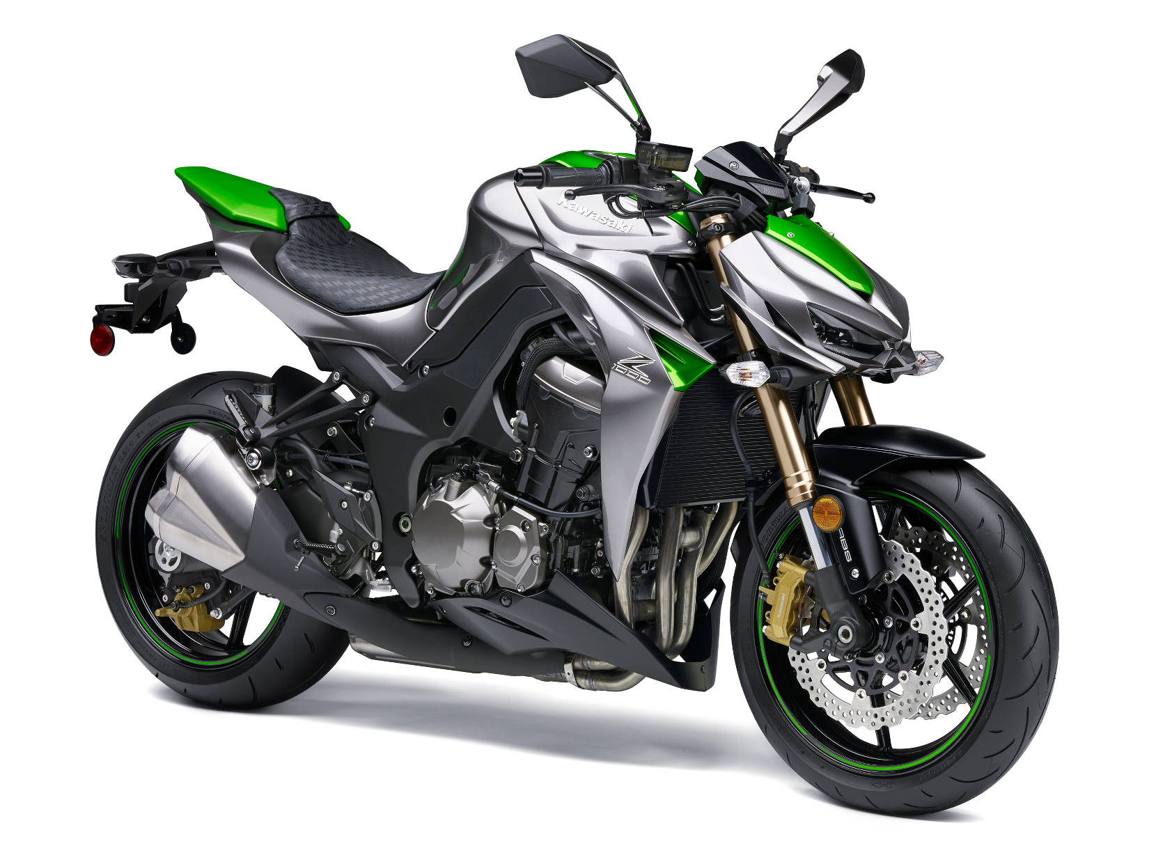
Take the latest Kawasaki Z1000, for instance. It should, by rights, be stunning. Its designer has been bold when it comes to the bike’s profile, using modern technology to give it a smaller headlight than would have been possible in the past. In silhouette it looks amazing – it has a stance that’s unlike anything else. But as soon as the lights come up they reveal that there’s such a confusion of surface detailing that the striking profile becomes lost as your brain tries to navigate the mismatched lines, curves, slashes, vents and intakes that pepper every available surface. It’s as though the designer has spent all his time looking at each component up close, fiddling with each of them over and over again and never stepping back to look at the whole.
And the Z1000 isn’t the only culprit. Look at any modern BMW and you’ll see the same problem. Sure, there’s no mistaking an S1000RR for anything else, but was it really only possible to get that sort of distinctiveness by ‘styling’ every component to within an inch of its life? Again, in isolation, each is great. Take a single piece from an S1000RR – the top yoke, for instance, or a lone side panel – and it looks brilliant. But bolt them all together and it’s a confusing smorgasbord of shapes.
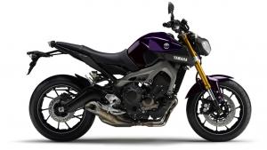
Cliché though it is, it seems the Italians are relatively immune to this – MV Agusta manages both details and overall shapes that appeal (Brit designer, so it must be the Italian air), and most Ducatis aren’t too hard on the eye either. The common theme seems to be that they’re not afraid to use relatively large, flat-ish panels. Show the vast expanse of a Panigale’s side fairing to a Japanese or German designer and he’d feel the need to punch holes in it or scar it with needless styling lines.
This ability to know when to stop, displayed on Italian bikes, extends to the paintwork, too. Few other countries seem to be able to offer something in just one colour, all over – at the very least they feel the need to add some black plastic or a few graphics to break things up. Why? It’s as though they’re ashamed of what they’ve created, and feel the need to distract the eye from the bigger picture by forcing us to pick up on the details.
What are your thoughts? Is bike design in decline or am I in the minority here?
��